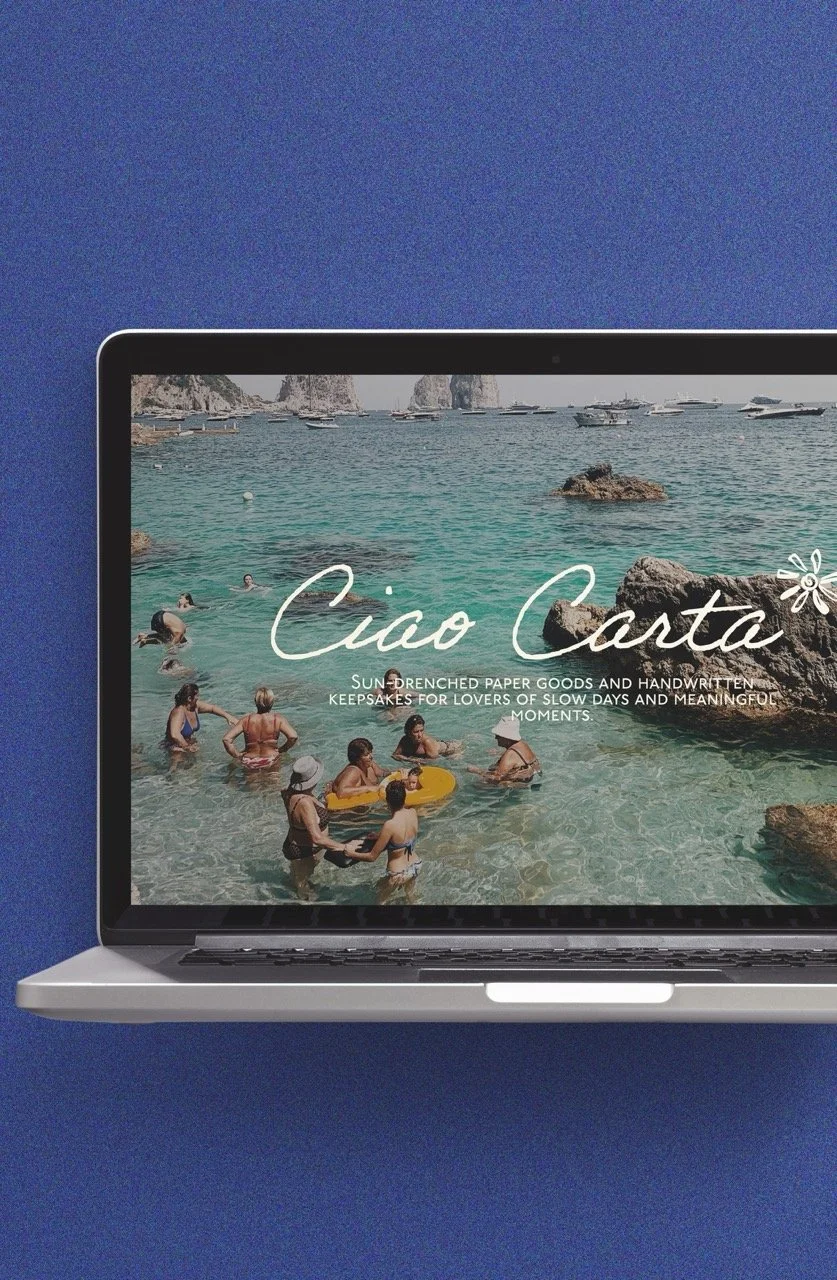
CIAO CARTA
web design, print design + branding
PLAYFUL, SUN SOAKED, ROMANTIC, CHEEKY
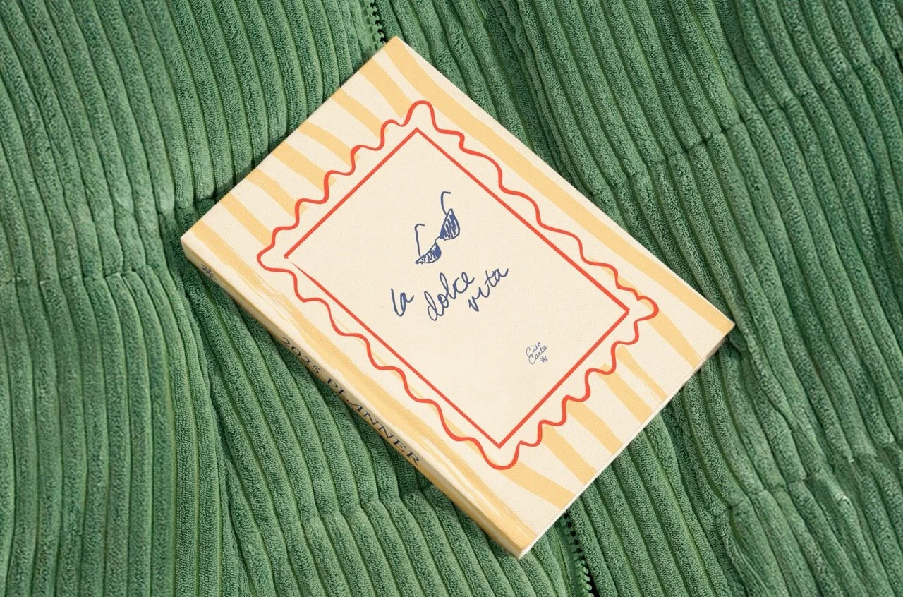
Ciao Carta is a stationery and print brand inspired by the slow pleasures of Italian summer — handwritten love notes, juicy lemons, and a touch of playful nostalgia. Designed to feel like a flirty postcard from the Amalfi Coast, this vibrant, cheeky, and sun-drenched brand brings personality and charm to an often overly minimal stationery space. Bold typography, warm vintage hues, and whimsical patterns come together to create a visual identity that feels fresh, joyful, and unapologetically fun. Whether it’s a tomato-red to-do list or a lemon-splashed postcard just because, Ciao Carta invites you to romanticise the everyday — one cheeky paper good at a time.
DELIVERABLES
+ 5 PAGE CUSTOM WEBSITE
+ LOGO SUITE AND BRAND MARKS
+ COLOUR PALETTE
+ TYPOGRAPHY SUITE
+ CUSTOM PRODUCT DESIGN

FILED UNDER:
INSPIRATION
COLOUR PALETTE